Challenge
Create toystore website that is intuitive and generates profit
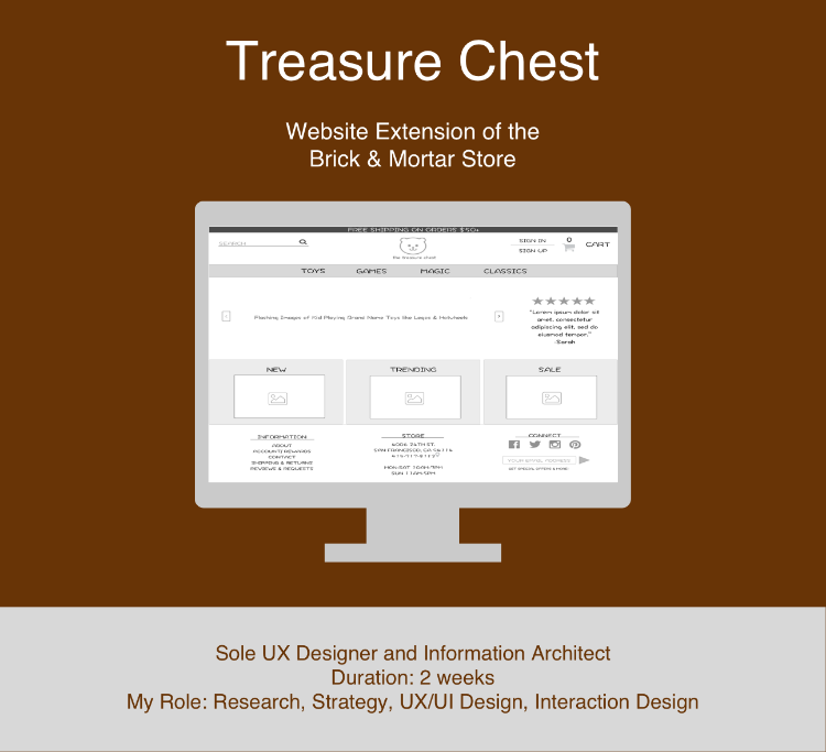
Class Project: The Treasure Chest is the biggest little toy store. To keep up with its local competition and stay popular in the market, it needs to create a website that provides customers the options to quickly browse and purchase toys online and the business to generate profit through another channel.
Solution
Intuitive to use, captures the company brand, keeps the business in mind
I created an interactive prototype of an e-commerce toy store that reflects the store brand while balancing user and business needs:
- intuitive and easy to navigate so people can quickly search for and buy toys
- captures the company brand of tradition, fun, creativity, and quality
- generates profit by making suggestions on product pages for items people may also like based on their order history
Process
website that balances the needs of the customers and clients

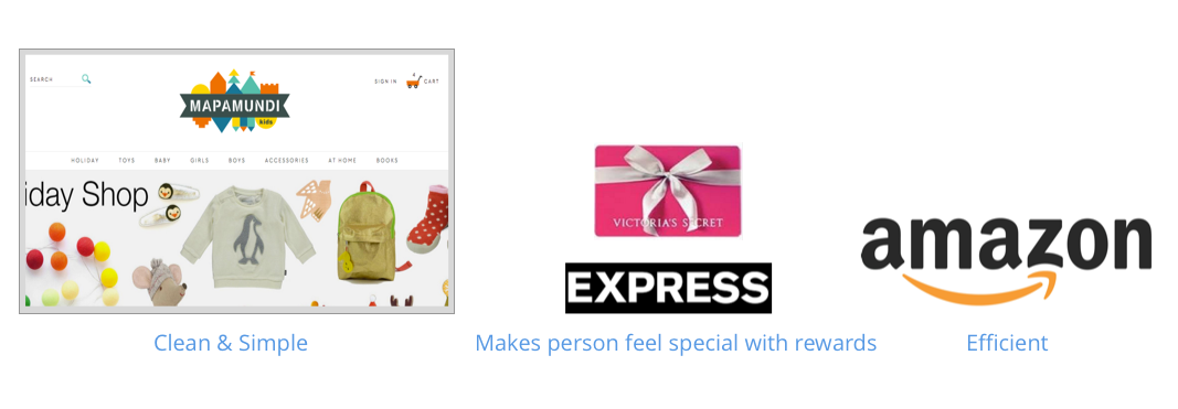
I asked the client a number of open-ended questions and studied the needs and desires of user personas. The client wants a website that makes a user feel special, has a clean look, Incorporates social media, and allows people to pick up toys in store. Users want an Intuitive site with easy navigation to find toys, and ratings and recommendations. I incorporated these features into the design.
Key inspirations
IMPORTANT TO HAVE DIFFERENT METHODS OF NAVIGATION
I had 4 people do an open card sort of the same toys. Everyone categorized the toys differently so it is important to have different methods of navigation on the website so people have different ways to find out what they are looking for.
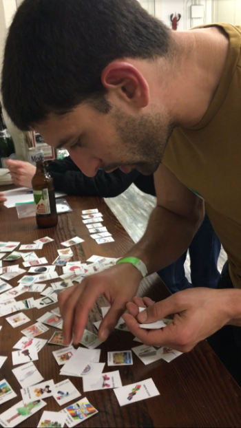
People used common terms when naming the categories
Although everyone organized the toys in different categories during the card sort, there were common terms that people used when naming the categories they put the toys in. For example, people put toys in categories like “outdoors” and “dolls”. I incorporated the use of these common terms in the navigation of my website.
FLOWS TO SEE THE NUMBER OF WIREFRAMES NEEDED
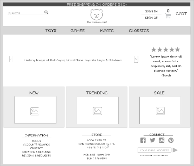
After choosing the website categories, I drew user flows and a site map, which helped me see the number of electronic wireframes needed to clearly show the user interaction in the prototype.
BEST TO GUIDE USERS TO PLACES THAT BEST SATISFY USER & THE BUSINESS NEEDS WITH A SIMPLE UI
- There are so many places a person could navigate to from the homepage. So it is important to make the places that best satisfy the user and business needs most prominent.
- It is important to keep the homepage’s user interface simple so users could easily absorb all the content and options in front of them and fulfill their task.
CONSTANT ITERATIONS TO IMPROVE DESIGN
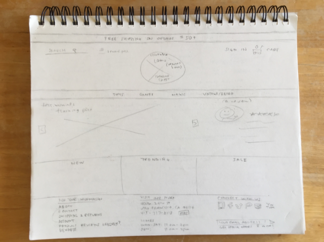
As usual, I first started out with a rough pencil sketch on paper of the electronic wireframes I would create.
I then created an interactive prototype and conducted usability testing.
Usability testing confirmed need for several navigation channels
Usability testing confirmed that people have really different preferences for navigation so my website would ensure the navigation channels are prominent wherever someone goes.
Need to capture the essence of the brand through the visuals
Also, people could feel the mood of the website right way from the aesthetics so I needed to ensure that I could capture the essence of the brand through the visuals as it would assist in creating the desired atmosphere.
Other Feedback FUELEd design
- I made my logo smaller so there was more space for everything else on the website.
- I also created more wireframes to better display the interactivity of the user with the website.
THE DELIVERABLE
Results and Reflections
“Ease of use was addressed with each user type and pain points”
When I presented the final interactive prototype to my client, the client was happy with the finished prototype.
- Client was impressed how the research and insights learned was incorporated into the prototype design.
- She enjoyed a lot of features that helped personalize the website and portray the store’s brand and other exciting features like the order summary and customer reviews.
Getting to the root of problem for success
Getting to the root of the problem and solving for that issue before giving attention to the other details, like the would be cool to have features, gave me success. Focus on the core problem helped me manage my time and prioritize features so I was able to deliver a product that solved the core problem and met client requirements.