
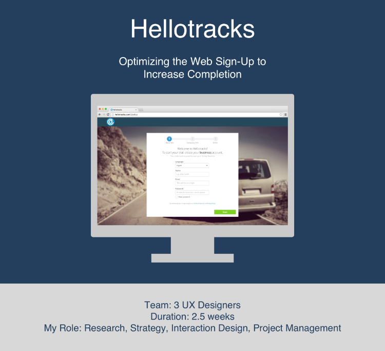
Context
Hellotracks is a field staff management mobile and web product
It is a location-based product that allows company owners, management, or dispatchers to see activities happening in the field so they can better manage their field staff. The management team has access to both a web dashboard and app to see field activities, while the field employees have to download an app to be tracked.
Challenge
Only 50% of signees complete the sign-up for service
Without completing the sign-up and downloading the app, potential customers are unable to view the benefits of the service.
Solution
Create intuitive sign-up and app download prompt
An intuitive sign-up will increase completion rate, and an app download prompt will improve user engagement with the app product.
Process
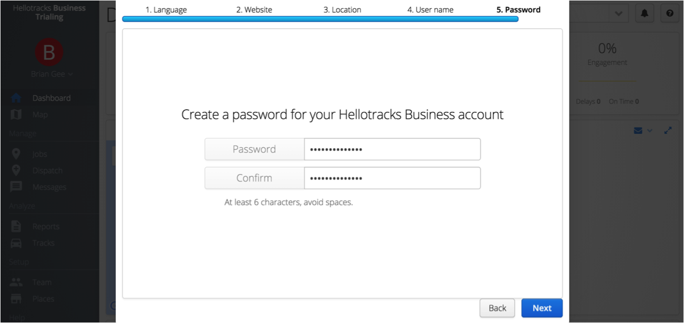
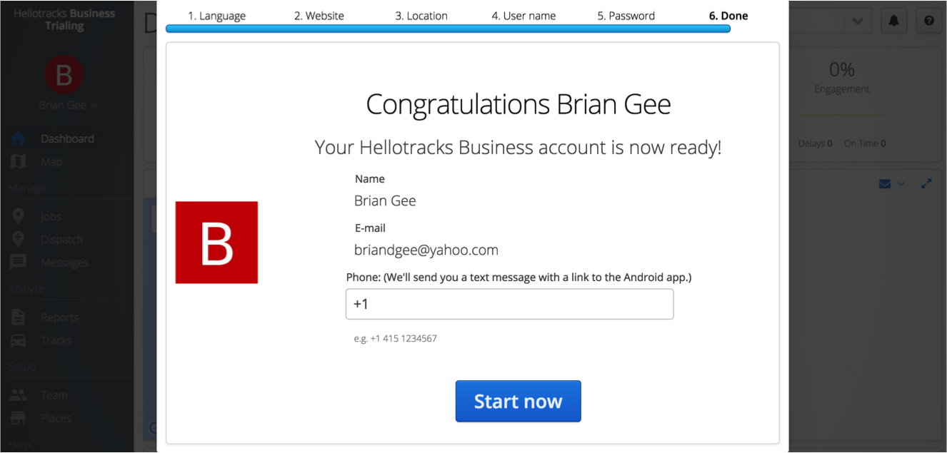
7 steps to complete sign-up
We observed the current sign-up and noticed it took 7 steps to get from the homepage to the dashboard.
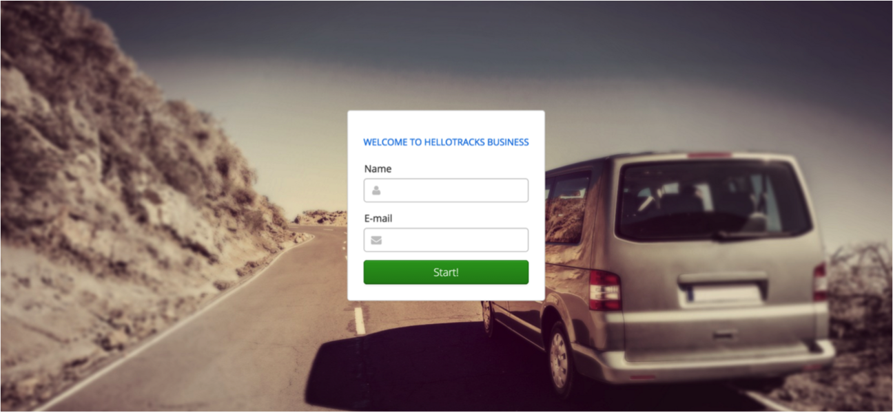
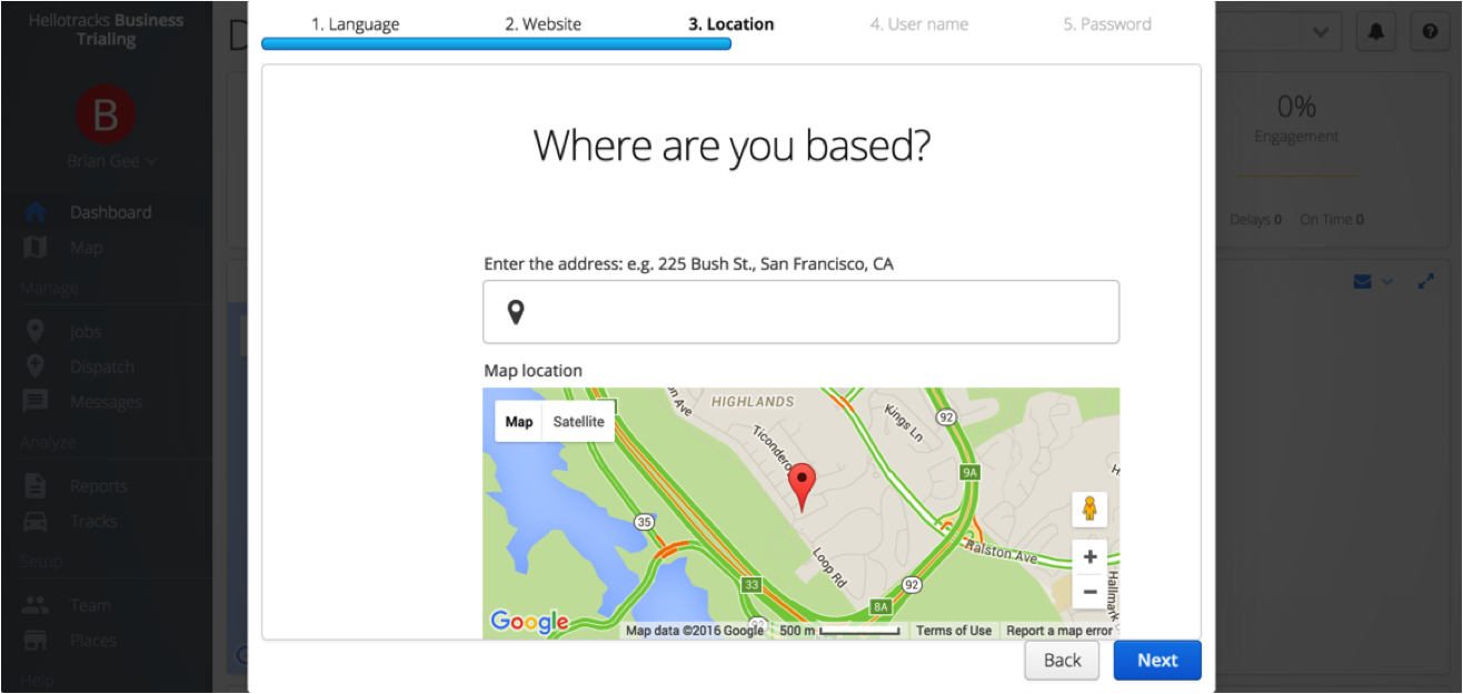
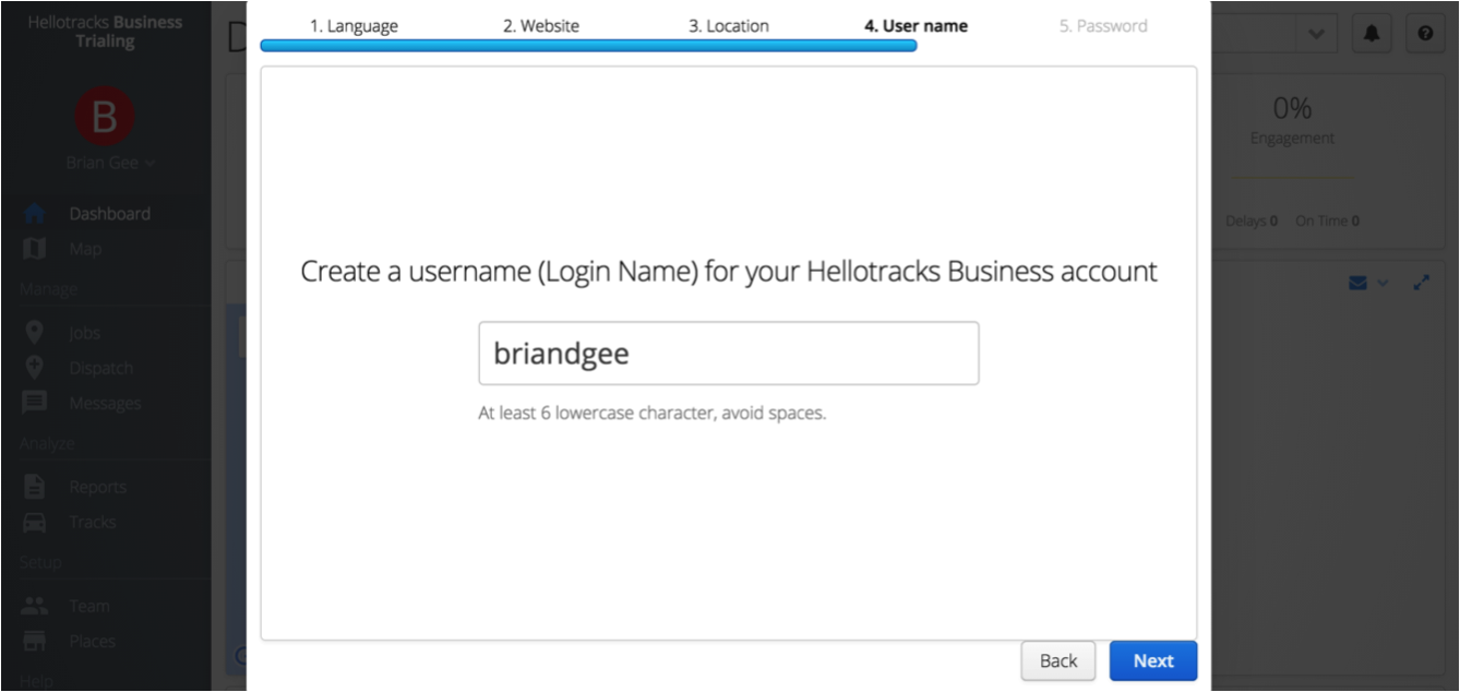
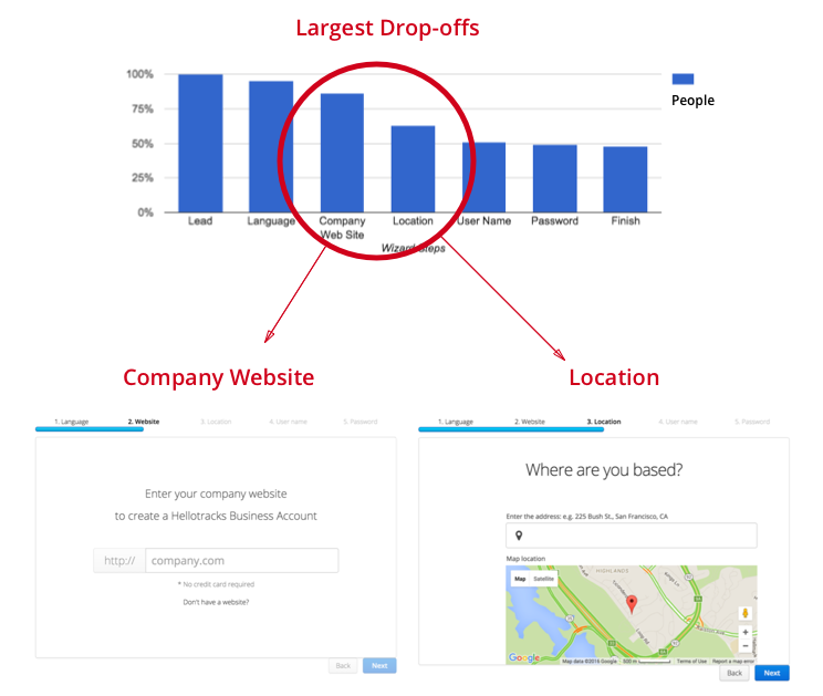
Company analytics show huge drop-off around the company website and location steps
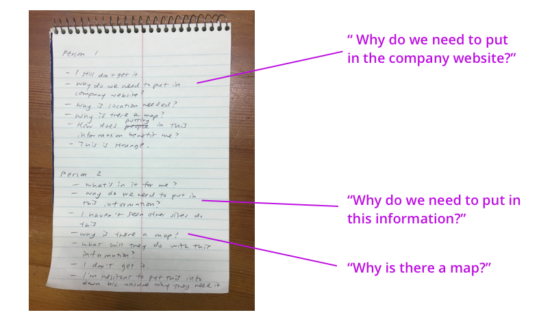
User interviews validate drop-off on those screens
We conducted 10 user interviews, and people repeatedly stopped at those screens and asked, “Why do we need this…?
Notes from User Interviews
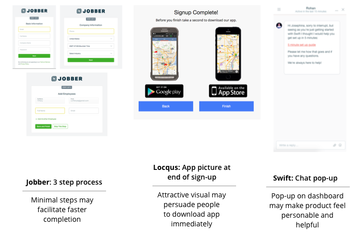
Competitive research showed possible intuitive ways to redesign sign-up
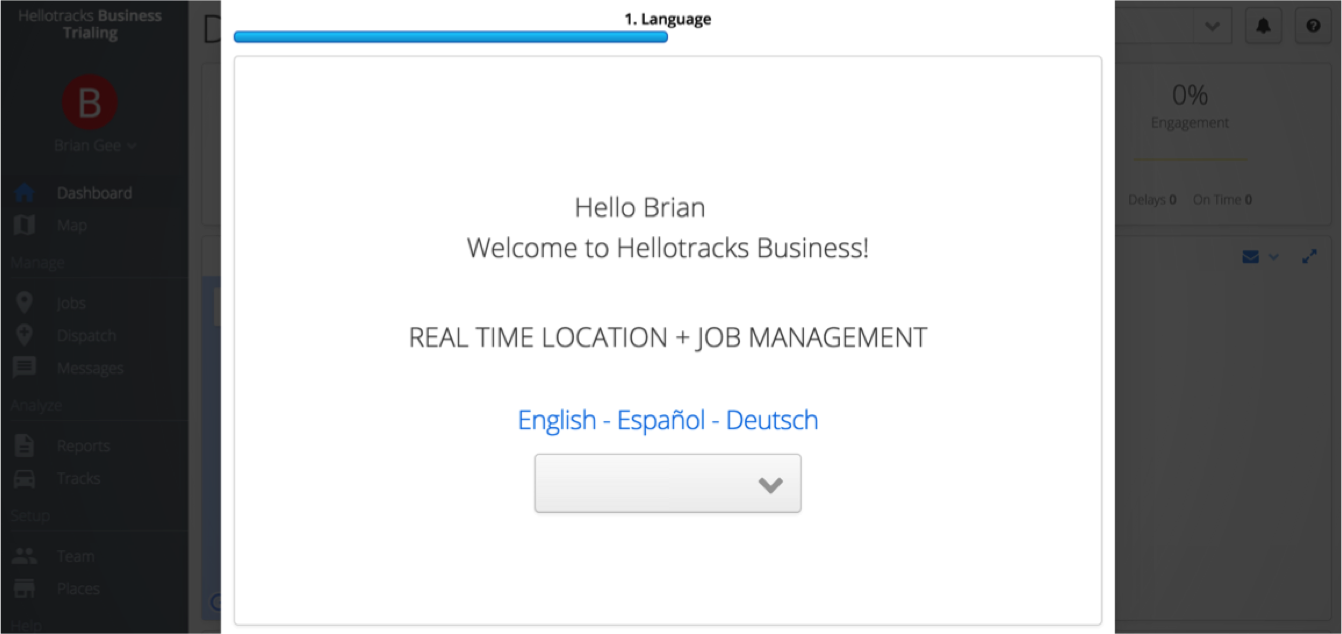
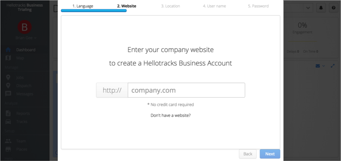
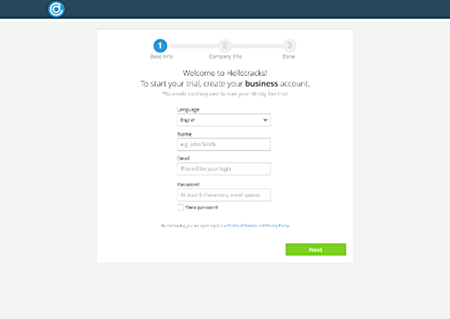
The First Design
We combined the features we found intuitive and helpful from competitors’ sites to alleviate the pain point areas of the current sign-up.
Iterate for rapid progress
A lean approach allowed us to iterate quickly and make rapid progress towards our solution.
- 45+ usability tests with the general population
- 2 in-depth interviews with target audience in the field
ACCOUNTS confusion DURING SIGN-UP
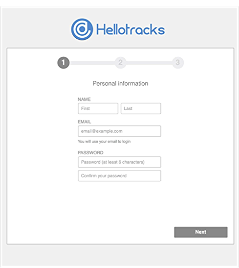
- We A/B tested a 1 page vs. 3 page sign-up.
- We learned that while the majority of research participants preferred the 3 page sign-up as they found it easier to digest information, there was still confusion regarding the admin and company accounts during the sign-up. We were equally confused. After several discussions with the client, the client informed it wasn't necessary to collect the company account information.
- Result: Kept the 3 page sign-up and omitted the request for company account information
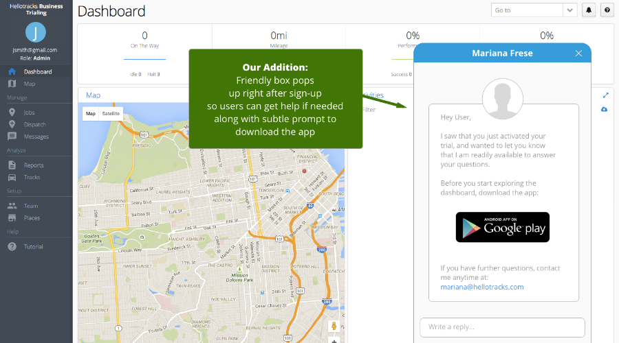
App download prompt in sign-up halts completion
Usability tests showed confusion with downloading the app at the last stage of the 3 page sign-up. User confusion halted sign-up completion. To address the app download issue, we moved the app download notification to the dashboard.
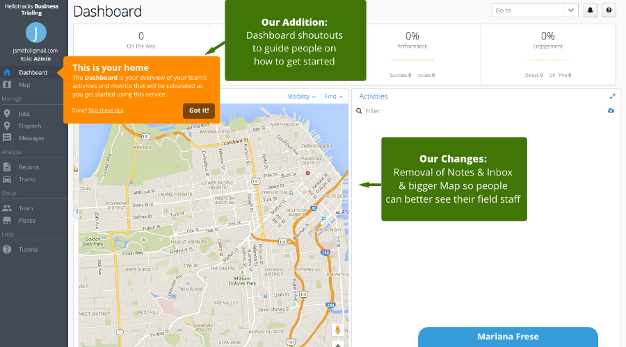
people need guidance and engagement at the dashboard
Once people got to the dashboard after sign-up they weren't sure what to do.
They also wanted a bigger map on the dashboard and felt no need for notes or inbox.
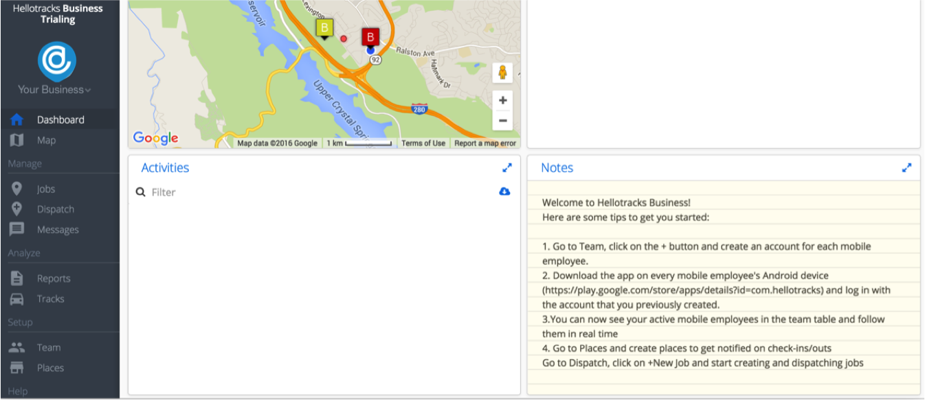
The Deliverable
THE FINAL PROTOTYPE
Results
"IS THAT IT?"
100% of the people we tested on the final design loved it. Users enjoyed the simplified sign-up process and were pleasantly surprised that 3 pages was all they had to do to to complete sign-up. They also were happy they understood where to go from the dashboard.
Client implementation
Our client was thrilled to see the final prototype showed positive user feedback. They informed us that the company will implement our proposed solution. They were happy to see all the insights we gathered, especially the insight on heavy user confusion between the company and admin accounts.
Reflections
Scope Management
Managing the scope of the app and client expectations throughout the whole process helped us succeed in meeting and surpassing client expectations. We had numerous discussions to clarify scope and misunderstandings and prioritized project activities based on time constraints.
More time needed to recruit from target audience
The client had forewarned us, and we experienced it for ourselves. I learned we needed more time to recruit research participants from the target audience. We tried to recruit for two weeks and were fortunate to get two target audience interviews.